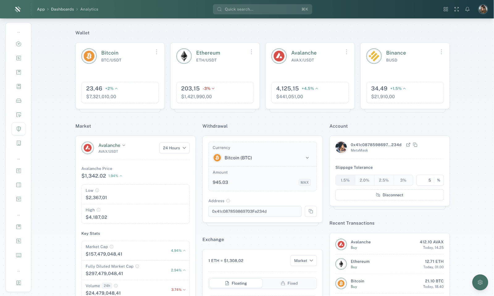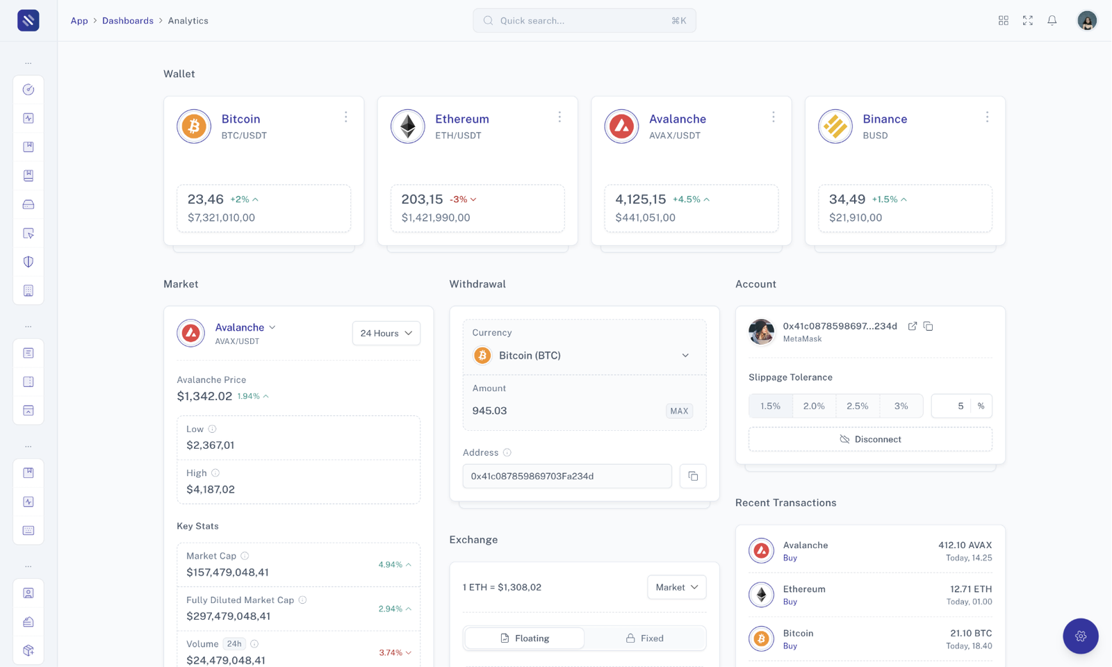


The "Blank Slide Over" component is a versatile tool that allows you to create customizable slide-over dialogs for various purposes on your website. It provides a clean and simple canvas for you to add your own content, making it suitable for a wide range of use cases.
                HTMLOpenTag!-- BEGIN: Slide Over Toggle --HTMLCloseTag
                                                HTMLOpenTagdiv class="text-center"HTMLCloseTag
                                                    HTMLOpenTaga
    data-tw-merge
    data-tw-toggle="modal" data-tw-target="#basic-slide-over-preview" href="#" class="transition duration-200 border shadow-sm inline-flex items-center justify-center py-2 px-3 rounded-md font-medium cursor-pointer focus:ring-4 focus:ring-primary focus:ring-opacity-20 focus-visible:outline-none dark:focus:ring-slate-700 dark:focus:ring-opacity-50 [&:hover:not(:disabled)]:bg-opacity-90 [&:hover:not(:disabled)]:border-opacity-90 [&:not(button)]:text-center disabled:opacity-70 disabled:cursor-not-allowed bg-primary border-primary text-white dark:border-primary"
HTMLCloseTagShow Slide OverHTMLOpenTag/aHTMLCloseTag
                                                HTMLOpenTag/divHTMLCloseTag
                                                HTMLOpenTag!-- END: Slide Over Toggle --HTMLCloseTag
                                                HTMLOpenTag!-- BEGIN: Slide Over Content --HTMLCloseTag
                                                HTMLOpenTagdiv
    data-tw-backdrop=""
    aria-hidden="true"
    tabindex="-1"
    id="basic-slide-over-preview" class="modal group bg-gradient-to-b from-theme-1/50 via-theme-2/50 to-black/50 transition-[visibility,opacity] w-screen h-screen fixed left-0 top-0 [&:not(.show)]:duration-[0s,0.2s] [&:not(.show)]:delay-[0.2s,0s] [&:not(.show)]:invisible [&:not(.show)]:opacity-0 [&.show]:visible [&.show]:opacity-100 [&.show]:duration-[0s,0.4s]"
HTMLCloseTagHTMLOpenTagdiv
    data-tw-merge
    class="w-[90%] ml-auto h-screen flex flex-col bg-white relative shadow-md transition-[margin-right] duration-[0.6s] -mr-[100%] group-[.show]:mr-0 dark:bg-darkmode-600 sm:w-[460px]"
HTMLCloseTagHTMLOpenTagdiv
    data-tw-merge
    class="flex items-center px-5 py-3 border-b border-slate-200/60 dark:border-darkmode-400 p-5"
HTMLCloseTagHTMLOpenTagh2 class="mr-auto text-base font-medium"HTMLCloseTag
                                                                Blank Slide Over
                                                            HTMLOpenTag/h2HTMLCloseTagHTMLOpenTag/divHTMLCloseTag
                                                        HTMLOpenTagdiv
    data-tw-merge
    class="p-5 overflow-y-auto flex-1"
HTMLCloseTagThis is totally awesome blank slide over!HTMLOpenTag/divHTMLCloseTagHTMLOpenTag/divHTMLCloseTagHTMLOpenTag/divHTMLCloseTag
                                                HTMLOpenTag!-- END: Slide Over Content --HTMLCloseTag
Whether you want to display additional information, gather user input, or present important updates, the "Blank Slideover" is a flexible solution that ensures your content remains accessible and engaging. Explore the possibilities and unlock new ways to interact with your audience using the "Blank Slideover" component.
The "Slideover Size" component allows you to control the dimensions of your slide-over dialogs, ensuring that they are visually appealing and perfectly tailored to your content. With multiple size options available, you can choose the one that best suits your specific use case.
                HTMLOpenTagdiv class="text-center"HTMLCloseTag
                                                    HTMLOpenTag!-- BEGIN: Small Slide Over Toggle --HTMLCloseTag
                                                    HTMLOpenTaga
    data-tw-merge
    data-tw-toggle="modal" data-tw-target="#small-slide-over-size-preview" href="#" class="transition duration-200 border shadow-sm inline-flex items-center justify-center py-2 px-3 rounded-md font-medium cursor-pointer focus:ring-4 focus:ring-primary focus:ring-opacity-20 focus-visible:outline-none dark:focus:ring-slate-700 dark:focus:ring-opacity-50 [&:hover:not(:disabled)]:bg-opacity-90 [&:hover:not(:disabled)]:border-opacity-90 [&:not(button)]:text-center disabled:opacity-70 disabled:cursor-not-allowed bg-primary border-primary text-white dark:border-primary mb-2 mr-1 mb-2 mr-1"
HTMLCloseTagShow Small Slide OverHTMLOpenTag/aHTMLCloseTag
                                                    HTMLOpenTag!-- END: Small Slide Over Toggle --HTMLCloseTag
                                                    HTMLOpenTag!-- BEGIN: Medium Slide Over Toggle --HTMLCloseTag
                                                    HTMLOpenTaga
    data-tw-merge
    data-tw-toggle="modal" data-tw-target="#medium-slide-over-size-preview" href="#" class="transition duration-200 border shadow-sm inline-flex items-center justify-center py-2 px-3 rounded-md font-medium cursor-pointer focus:ring-4 focus:ring-primary focus:ring-opacity-20 focus-visible:outline-none dark:focus:ring-slate-700 dark:focus:ring-opacity-50 [&:hover:not(:disabled)]:bg-opacity-90 [&:hover:not(:disabled)]:border-opacity-90 [&:not(button)]:text-center disabled:opacity-70 disabled:cursor-not-allowed bg-primary border-primary text-white dark:border-primary mb-2 mr-1 mb-2 mr-1"
HTMLCloseTagShow Medium Slide OverHTMLOpenTag/aHTMLCloseTag
                                                    HTMLOpenTag!-- END: Medium Slide Over Toggle --HTMLCloseTag
                                                    HTMLOpenTag!-- BEGIN: Large Slide Over Toggle --HTMLCloseTag
                                                    HTMLOpenTaga
    data-tw-merge
    data-tw-toggle="modal" data-tw-target="#large-slide-over-size-preview" href="#" class="transition duration-200 border shadow-sm inline-flex items-center justify-center py-2 px-3 rounded-md font-medium cursor-pointer focus:ring-4 focus:ring-primary focus:ring-opacity-20 focus-visible:outline-none dark:focus:ring-slate-700 dark:focus:ring-opacity-50 [&:hover:not(:disabled)]:bg-opacity-90 [&:hover:not(:disabled)]:border-opacity-90 [&:not(button)]:text-center disabled:opacity-70 disabled:cursor-not-allowed bg-primary border-primary text-white dark:border-primary mb-2 mr-1 mb-2 mr-1"
HTMLCloseTagShow Large Slide OverHTMLOpenTag/aHTMLCloseTag
                                                    HTMLOpenTag!-- END: Large Slide Over Toggle --HTMLCloseTag
                                                    HTMLOpenTag!-- BEGIN: Super Large Slide Over Toggle --HTMLCloseTag
                                                    HTMLOpenTaga
    data-tw-merge
    data-tw-toggle="modal" data-tw-target="#superlarge-slide-over-size-preview" href="#" class="transition duration-200 border shadow-sm inline-flex items-center justify-center py-2 px-3 rounded-md font-medium cursor-pointer focus:ring-4 focus:ring-primary focus:ring-opacity-20 focus-visible:outline-none dark:focus:ring-slate-700 dark:focus:ring-opacity-50 [&:hover:not(:disabled)]:bg-opacity-90 [&:hover:not(:disabled)]:border-opacity-90 [&:not(button)]:text-center disabled:opacity-70 disabled:cursor-not-allowed bg-primary border-primary text-white dark:border-primary mb-2 mr-1 mb-2 mr-1"
HTMLCloseTagShow Superlarge Slide OverHTMLOpenTag/aHTMLCloseTag
                                                    HTMLOpenTag!-- END: Super Large Slide Over Toggle --HTMLCloseTag
                                                HTMLOpenTag/divHTMLCloseTag
                                                HTMLOpenTag!-- BEGIN: Small Slide Over Content --HTMLCloseTag
                                                HTMLOpenTagdiv
    data-tw-backdrop=""
    aria-hidden="true"
    tabindex="-1"
    id="small-slide-over-size-preview" class="modal group bg-gradient-to-b from-theme-1/50 via-theme-2/50 to-black/50 transition-[visibility,opacity] w-screen h-screen fixed left-0 top-0 [&:not(.show)]:duration-[0s,0.2s] [&:not(.show)]:delay-[0.2s,0s] [&:not(.show)]:invisible [&:not(.show)]:opacity-0 [&.show]:visible [&.show]:opacity-100 [&.show]:duration-[0s,0.4s]"
HTMLCloseTagHTMLOpenTagdiv
    data-tw-merge
    class="w-[90%] ml-auto h-screen flex flex-col bg-white relative shadow-md transition-[margin-right] duration-[0.6s] -mr-[100%] group-[.show]:mr-0 dark:bg-darkmode-600  sm:w-[300px]"
HTMLCloseTagHTMLOpenTagdiv
    data-tw-merge
    class="flex items-center px-5 py-3 border-b border-slate-200/60 dark:border-darkmode-400 p-5"
HTMLCloseTagHTMLOpenTagh2 class="mr-auto text-base font-medium"HTMLCloseTag
                                                                Small Slide Over
                                                            HTMLOpenTag/h2HTMLCloseTagHTMLOpenTag/divHTMLCloseTag
                                                        HTMLOpenTagdiv
    data-tw-merge
    class="p-5 overflow-y-auto flex-1"
HTMLCloseTagThis is totally awesome small slide over!HTMLOpenTag/divHTMLCloseTagHTMLOpenTag/divHTMLCloseTagHTMLOpenTag/divHTMLCloseTag
                                                HTMLOpenTag!-- END: Small Slide Over Content --HTMLCloseTag
                                                HTMLOpenTag!-- BEGIN: Medium Slide Over Content --HTMLCloseTag
                                                HTMLOpenTagdiv
    data-tw-backdrop=""
    aria-hidden="true"
    tabindex="-1"
    id="medium-slide-over-size-preview" class="modal group bg-gradient-to-b from-theme-1/50 via-theme-2/50 to-black/50 transition-[visibility,opacity] w-screen h-screen fixed left-0 top-0 [&:not(.show)]:duration-[0s,0.2s] [&:not(.show)]:delay-[0.2s,0s] [&:not(.show)]:invisible [&:not(.show)]:opacity-0 [&.show]:visible [&.show]:opacity-100 [&.show]:duration-[0s,0.4s]"
HTMLCloseTagHTMLOpenTagdiv
    data-tw-merge
    class="w-[90%] ml-auto h-screen flex flex-col bg-white relative shadow-md transition-[margin-right] duration-[0.6s] -mr-[100%] group-[.show]:mr-0 dark:bg-darkmode-600 sm:w-[460px]"
HTMLCloseTagHTMLOpenTagdiv
    data-tw-merge
    class="flex items-center px-5 py-3 border-b border-slate-200/60 dark:border-darkmode-400 p-5"
HTMLCloseTagHTMLOpenTagh2 class="mr-auto text-base font-medium"HTMLCloseTag
                                                                Medium Slide Over
                                                            HTMLOpenTag/h2HTMLCloseTagHTMLOpenTag/divHTMLCloseTag
                                                        HTMLOpenTagdiv
    data-tw-merge
    class="p-5 overflow-y-auto flex-1"
HTMLCloseTagThis is totally awesome medium slide over!HTMLOpenTag/divHTMLCloseTagHTMLOpenTag/divHTMLCloseTagHTMLOpenTag/divHTMLCloseTag
                                                HTMLOpenTag!-- END: Medium Slide Over Content --HTMLCloseTag
                                                HTMLOpenTag!-- BEGIN: Large Slide Over Content --HTMLCloseTag
                                                HTMLOpenTagdiv
    data-tw-backdrop=""
    aria-hidden="true"
    tabindex="-1"
    id="large-slide-over-size-preview" class="modal group bg-gradient-to-b from-theme-1/50 via-theme-2/50 to-black/50 transition-[visibility,opacity] w-screen h-screen fixed left-0 top-0 [&:not(.show)]:duration-[0s,0.2s] [&:not(.show)]:delay-[0.2s,0s] [&:not(.show)]:invisible [&:not(.show)]:opacity-0 [&.show]:visible [&.show]:opacity-100 [&.show]:duration-[0s,0.4s]"
HTMLCloseTagHTMLOpenTagdiv
    data-tw-merge
    class="w-[90%] ml-auto h-screen flex flex-col bg-white relative shadow-md transition-[margin-right] duration-[0.6s] -mr-[100%] group-[.show]:mr-0 dark:bg-darkmode-600   sm:w-[600px]"
HTMLCloseTagHTMLOpenTagdiv
    data-tw-merge
    class="flex items-center px-5 py-3 border-b border-slate-200/60 dark:border-darkmode-400 p-5"
HTMLCloseTagHTMLOpenTagh2 class="mr-auto text-base font-medium"HTMLCloseTag
                                                                Large Slide Over
                                                            HTMLOpenTag/h2HTMLCloseTagHTMLOpenTag/divHTMLCloseTag
                                                        HTMLOpenTagdiv
    data-tw-merge
    class="p-5 overflow-y-auto flex-1"
HTMLCloseTagThis is totally awesome large slide over!HTMLOpenTag/divHTMLCloseTagHTMLOpenTag/divHTMLCloseTagHTMLOpenTag/divHTMLCloseTag
                                                HTMLOpenTag!-- END: Large Slide Over Content --HTMLCloseTag
                                                HTMLOpenTag!-- BEGIN: Super Large Slide Over Content --HTMLCloseTag
                                                HTMLOpenTagdiv
    data-tw-backdrop=""
    aria-hidden="true"
    tabindex="-1"
    id="superlarge-slide-over-size-preview" class="modal group bg-gradient-to-b from-theme-1/50 via-theme-2/50 to-black/50 transition-[visibility,opacity] w-screen h-screen fixed left-0 top-0 [&:not(.show)]:duration-[0s,0.2s] [&:not(.show)]:delay-[0.2s,0s] [&:not(.show)]:invisible [&:not(.show)]:opacity-0 [&.show]:visible [&.show]:opacity-100 [&.show]:duration-[0s,0.4s]"
HTMLCloseTagHTMLOpenTagdiv
    data-tw-merge
    class="w-[90%] ml-auto h-screen flex flex-col bg-white relative shadow-md transition-[margin-right] duration-[0.6s] -mr-[100%] group-[.show]:mr-0 dark:bg-darkmode-600    sm:w-[600px] lg:w-[900px]"
HTMLCloseTagHTMLOpenTagdiv
    data-tw-merge
    class="flex items-center px-5 py-3 border-b border-slate-200/60 dark:border-darkmode-400 p-5"
HTMLCloseTagHTMLOpenTagh2 class="mr-auto text-base font-medium"HTMLCloseTag
                                                                Superlarge Slide Over
                                                            HTMLOpenTag/h2HTMLCloseTagHTMLOpenTag/divHTMLCloseTag
                                                        HTMLOpenTagdiv
    data-tw-merge
    class="p-5 overflow-y-auto flex-1"
HTMLCloseTagThis is totally awesome superlarge slide over!HTMLOpenTag/divHTMLCloseTagHTMLOpenTag/divHTMLCloseTagHTMLOpenTag/divHTMLCloseTag
                                                HTMLOpenTag!-- END: Super Large Slide Over Content --HTMLCloseTag
Tailor the size of your slideover to create a user-friendly and visually engaging experience. Whether you need a compact notification or a spacious form, the "Slideover Size" component gives you the flexibility to achieve your desired layout. Explore the different size options and elevate your website's user experience with the "Slideover Size" component.
The "Slide Over with Close Button" component adds an extra layer of user convenience to your slide-over dialogs. This feature allows users to easily dismiss the slide-over by clicking a close button, enhancing the overall user experience.
                HTMLOpenTag!-- BEGIN: Modal Toggle --HTMLCloseTag
                                                HTMLOpenTagdiv class="text-center"HTMLCloseTag
                                                    HTMLOpenTaga
    data-tw-merge
    data-tw-toggle="modal" data-tw-target="#button-slide-over-preview" href="#" class="transition duration-200 border shadow-sm inline-flex items-center justify-center py-2 px-3 rounded-md font-medium cursor-pointer focus:ring-4 focus:ring-primary focus:ring-opacity-20 focus-visible:outline-none dark:focus:ring-slate-700 dark:focus:ring-opacity-50 [&:hover:not(:disabled)]:bg-opacity-90 [&:hover:not(:disabled)]:border-opacity-90 [&:not(button)]:text-center disabled:opacity-70 disabled:cursor-not-allowed bg-primary border-primary text-white dark:border-primary"
HTMLCloseTagShow Slide OverHTMLOpenTag/aHTMLCloseTag
                                                HTMLOpenTag/divHTMLCloseTag
                                                HTMLOpenTag!-- END: Modal Toggle --HTMLCloseTag
                                                HTMLOpenTag!-- BEGIN: Modal Content --HTMLCloseTag
                                                HTMLOpenTagdiv
    data-tw-backdrop="static"
    aria-hidden="true"
    tabindex="-1"
    id="button-slide-over-preview" class="modal group bg-gradient-to-b from-theme-1/50 via-theme-2/50 to-black/50 transition-[visibility,opacity] w-screen h-screen fixed left-0 top-0 [&:not(.show)]:duration-[0s,0.2s] [&:not(.show)]:delay-[0.2s,0s] [&:not(.show)]:invisible [&:not(.show)]:opacity-0 [&.show]:visible [&.show]:opacity-100 [&.show]:duration-[0s,0.4s]"
HTMLCloseTagHTMLOpenTagdiv
    data-tw-merge
    class="w-[90%] ml-auto h-screen flex flex-col bg-white relative shadow-md transition-[margin-right] duration-[0.6s] -mr-[100%] group-[.show]:mr-0 dark:bg-darkmode-600 sm:w-[460px]"
HTMLCloseTagHTMLOpenTaga
                                                            class="absolute top-0 left-0 right-auto mt-4 -ml-10 sm:-ml-12"
                                                            data-tw-dismiss="modal"
                                                            href="#"
                                                        HTMLCloseTag
                                                            HTMLOpenTagi
    data-tw-merge
    data-lucide="x"
    class="stroke-[1] w-5 h-5 w-8 h-8 text-slate-400 w-8 h-8 text-slate-400"
HTMLCloseTagHTMLOpenTag/iHTMLCloseTag


                                                        HTMLOpenTag/aHTMLCloseTag
                                                        HTMLOpenTagdiv
    data-tw-merge
    class="flex items-center px-5 py-3 border-b border-slate-200/60 dark:border-darkmode-400 p-5"
HTMLCloseTagHTMLOpenTagh2 class="mr-auto text-base font-medium"HTMLCloseTag
                                                                Slide Over With Close Button
                                                            HTMLOpenTag/h2HTMLCloseTagHTMLOpenTag/divHTMLCloseTag
                                                        HTMLOpenTagdiv
    data-tw-merge
    class="p-5 overflow-y-auto flex-1"
HTMLCloseTagThis is totally awesome slide over with close button!HTMLOpenTag/divHTMLCloseTagHTMLOpenTag/divHTMLCloseTagHTMLOpenTag/divHTMLCloseTag
                                                HTMLOpenTag!-- END: Modal Content --HTMLCloseTag
The "Slide Over with Close Button" component enhances user interaction by offering a clear and intuitive method for closing the slide-over. It's particularly useful for scenarios where users may want to quickly exit or minimize the dialog without navigating away from the current page.
The "Overlapping Slide Over" is a versatile feature that allows you to create layered slide-over dialogs within your web application. This feature is perfect for scenarios where you need to present information or actions in a sequential manner while keeping the user focused.
                HTMLOpenTag!-- BEGIN: Slide Over Toggle --HTMLCloseTag
                                                HTMLOpenTagdiv class="text-center"HTMLCloseTag
                                                    HTMLOpenTaga
    data-tw-merge
    data-tw-toggle="modal" data-tw-target="#overlapping-slide-over-preview" href="#" class="transition duration-200 border shadow-sm inline-flex items-center justify-center py-2 px-3 rounded-md font-medium cursor-pointer focus:ring-4 focus:ring-primary focus:ring-opacity-20 focus-visible:outline-none dark:focus:ring-slate-700 dark:focus:ring-opacity-50 [&:hover:not(:disabled)]:bg-opacity-90 [&:hover:not(:disabled)]:border-opacity-90 [&:not(button)]:text-center disabled:opacity-70 disabled:cursor-not-allowed bg-primary border-primary text-white dark:border-primary"
HTMLCloseTagShow Slide OverHTMLOpenTag/aHTMLCloseTag
                                                HTMLOpenTag/divHTMLCloseTag
                                                HTMLOpenTag!-- END: Slide Over Toggle --HTMLCloseTag
                                                HTMLOpenTag!-- BEGIN: Slide Over Content --HTMLCloseTag
                                                HTMLOpenTagdiv
    data-tw-backdrop=""
    aria-hidden="true"
    tabindex="-1"
    id="overlapping-slide-over-preview" class="modal group bg-gradient-to-b from-theme-1/50 via-theme-2/50 to-black/50 transition-[visibility,opacity] w-screen h-screen fixed left-0 top-0 [&:not(.show)]:duration-[0s,0.2s] [&:not(.show)]:delay-[0.2s,0s] [&:not(.show)]:invisible [&:not(.show)]:opacity-0 [&.show]:visible [&.show]:opacity-100 [&.show]:duration-[0s,0.4s]"
HTMLCloseTagHTMLOpenTagdiv
    data-tw-merge
    class="w-[90%] ml-auto h-screen flex flex-col bg-white relative shadow-md transition-[margin-right] duration-[0.6s] -mr-[100%] group-[.show]:mr-0 dark:bg-darkmode-600 sm:w-[460px]"
HTMLCloseTagHTMLOpenTagdiv
    data-tw-merge
    class="flex items-center px-5 py-3 border-b border-slate-200/60 dark:border-darkmode-400 p-5"
HTMLCloseTagHTMLOpenTagh2 class="mr-auto text-base font-medium"HTMLCloseTag
                                                                Overlapping Slide Over
                                                            HTMLOpenTag/h2HTMLCloseTagHTMLOpenTag/divHTMLCloseTag
                                                        HTMLOpenTagdiv
    data-tw-merge
    class="p-5 overflow-y-auto flex-1 px-5 py-10"
HTMLCloseTagHTMLOpenTagdiv class="text-center"HTMLCloseTag
                                                                HTMLOpenTagdiv class="mb-5"HTMLCloseTag
                                                                    Click button bellow to show overlapping slide
                                                                    over!
                                                                HTMLOpenTag/divHTMLCloseTag
                                                                HTMLOpenTag!-- BEGIN: Overlapping Slide Over Toggle --HTMLCloseTag
                                                                HTMLOpenTaga
    data-tw-merge
    data-tw-toggle="modal" data-tw-target="#next-overlapping-slide-over-preview" href="#" class="transition duration-200 border shadow-sm inline-flex items-center justify-center py-2 px-3 rounded-md font-medium cursor-pointer focus:ring-4 focus:ring-primary focus:ring-opacity-20 focus-visible:outline-none dark:focus:ring-slate-700 dark:focus:ring-opacity-50 [&:hover:not(:disabled)]:bg-opacity-90 [&:hover:not(:disabled)]:border-opacity-90 [&:not(button)]:text-center disabled:opacity-70 disabled:cursor-not-allowed bg-primary border-primary text-white dark:border-primary"
HTMLCloseTagShow Overlapping Slide OverHTMLOpenTag/aHTMLCloseTag
                                                                HTMLOpenTag!-- END: Overlapping Slide Over Toggle --HTMLCloseTag
                                                                HTMLOpenTag!-- BEGIN: Overlapping Slide Over Content --HTMLCloseTag
                                                                HTMLOpenTagdiv
    data-tw-backdrop=""
    aria-hidden="true"
    tabindex="-1"
    id="next-overlapping-slide-over-preview" class="modal group bg-gradient-to-b from-theme-1/50 via-theme-2/50 to-black/50 transition-[visibility,opacity] w-screen h-screen fixed left-0 top-0 [&:not(.show)]:duration-[0s,0.2s] [&:not(.show)]:delay-[0.2s,0s] [&:not(.show)]:invisible [&:not(.show)]:opacity-0 [&.show]:visible [&.show]:opacity-100 [&.show]:duration-[0s,0.4s]"
HTMLCloseTagHTMLOpenTagdiv
    data-tw-merge
    class="w-[90%] ml-auto h-screen flex flex-col bg-white relative shadow-md transition-[margin-right] duration-[0.6s] -mr-[100%] group-[.show]:mr-0 dark:bg-darkmode-600 sm:w-[460px]"
HTMLCloseTagHTMLOpenTagdiv
    data-tw-merge
    class="flex items-center px-5 py-3 border-b border-slate-200/60 dark:border-darkmode-400 p-5"
HTMLCloseTagHTMLOpenTagh2 class="mr-auto text-base font-medium"HTMLCloseTag
                                                                                Overlapping Slide Over
                                                                            HTMLOpenTag/h2HTMLCloseTagHTMLOpenTag/divHTMLCloseTag
                                                                        HTMLOpenTagdiv
    data-tw-merge
    class="p-5 overflow-y-auto flex-1 text-center"
HTMLCloseTagThis is totally awesome overlapping slide
                                                                            over!HTMLOpenTag/divHTMLCloseTagHTMLOpenTag/divHTMLCloseTagHTMLOpenTag/divHTMLCloseTag
                                                                HTMLOpenTag!-- END: Overlapping Slide Over Content --HTMLCloseTag
                                                            HTMLOpenTag/divHTMLCloseTagHTMLOpenTag/divHTMLCloseTagHTMLOpenTag/divHTMLCloseTagHTMLOpenTag/divHTMLCloseTag
                                                HTMLOpenTag!-- END: Slide Over Content --HTMLCloseTag
The "Overlapping Slide Over" feature provides a user-friendly way to present information or actions progressively, ensuring that users can focus on one piece of content at a time. It's a valuable tool for creating engaging user experiences and guiding users through complex workflows. Explore the possibilities of this feature to enhance your web application's usability and interactivity.
The "Header & Footer Slide Over" component is a powerful tool to create slide-over dialogs with customized headers and footers. This feature enables you to present content to your users while maintaining a consistent user interface and providing additional functionality in the header and footer sections.
                HTMLOpenTag!-- BEGIN: Slide Over Toggle --HTMLCloseTag
                                                HTMLOpenTagdiv class="text-center"HTMLCloseTag
                                                    HTMLOpenTaga
    data-tw-merge
    data-tw-toggle="modal" data-tw-target="#header-footer-slide-over-preview" href="#" class="transition duration-200 border shadow-sm inline-flex items-center justify-center py-2 px-3 rounded-md font-medium cursor-pointer focus:ring-4 focus:ring-primary focus:ring-opacity-20 focus-visible:outline-none dark:focus:ring-slate-700 dark:focus:ring-opacity-50 [&:hover:not(:disabled)]:bg-opacity-90 [&:hover:not(:disabled)]:border-opacity-90 [&:not(button)]:text-center disabled:opacity-70 disabled:cursor-not-allowed bg-primary border-primary text-white dark:border-primary"
HTMLCloseTagShow Slide OverHTMLOpenTag/aHTMLCloseTag
                                                HTMLOpenTag/divHTMLCloseTag
                                                HTMLOpenTag!-- END: Slide Over Toggle --HTMLCloseTag
                                                HTMLOpenTag!-- BEGIN: Slide Over Content --HTMLCloseTag
                                                HTMLOpenTagdiv
    data-tw-backdrop="static"
    aria-hidden="true"
    tabindex="-1"
    id="header-footer-slide-over-preview" class="modal group bg-gradient-to-b from-theme-1/50 via-theme-2/50 to-black/50 transition-[visibility,opacity] w-screen h-screen fixed left-0 top-0 [&:not(.show)]:duration-[0s,0.2s] [&:not(.show)]:delay-[0.2s,0s] [&:not(.show)]:invisible [&:not(.show)]:opacity-0 [&.show]:visible [&.show]:opacity-100 [&.show]:duration-[0s,0.4s]"
HTMLCloseTagHTMLOpenTag!-- BEGIN: Slide Over Header --HTMLCloseTag
                                                    HTMLOpenTagdiv
    data-tw-merge
    class="w-[90%] ml-auto h-screen flex flex-col bg-white relative shadow-md transition-[margin-right] duration-[0.6s] -mr-[100%] group-[.show]:mr-0 dark:bg-darkmode-600 sm:w-[460px]"
HTMLCloseTagHTMLOpenTaga
                                                            class="absolute top-0 left-0 right-auto mt-4 -ml-10 sm:-ml-12"
                                                            data-tw-dismiss="modal"
                                                            href="#"
                                                        HTMLCloseTag
                                                            HTMLOpenTagi
    data-tw-merge
    data-lucide="x"
    class="stroke-[1] w-5 h-5 w-8 h-8 text-slate-400 w-8 h-8 text-slate-400"
HTMLCloseTagHTMLOpenTag/iHTMLCloseTag


                                                        HTMLOpenTag/aHTMLCloseTag
                                                        HTMLOpenTagdiv
    data-tw-merge
    class="flex items-center px-5 py-3 border-b border-slate-200/60 dark:border-darkmode-400"
HTMLCloseTagHTMLOpenTagh2 class="mr-auto text-base font-medium"HTMLCloseTag
                                                                Broadcast Message
                                                            HTMLOpenTag/h2HTMLCloseTag
                                                            HTMLOpenTagbutton
    data-tw-merge
    class="transition duration-200 border shadow-sm inline-flex items-center justify-center py-2 px-3 rounded-md font-medium cursor-pointer focus:ring-4 focus:ring-primary focus:ring-opacity-20 focus-visible:outline-none dark:focus:ring-slate-700 dark:focus:ring-opacity-50 [&:hover:not(:disabled)]:bg-opacity-90 [&:hover:not(:disabled)]:border-opacity-90 [&:not(button)]:text-center disabled:opacity-70 disabled:cursor-not-allowed border-secondary text-slate-500 dark:border-darkmode-100/40 dark:text-slate-300 [&:hover:not(:disabled)]:bg-secondary/20 [&:hover:not(:disabled)]:dark:bg-darkmode-100/10 hidden sm:flex hidden sm:flex"
HTMLCloseTagHTMLOpenTagi
    data-tw-merge
    data-lucide="file"
    class="stroke-[1] w-5 h-5 w-4 h-4 mr-2 w-4 h-4 mr-2"
HTMLCloseTagHTMLOpenTag/iHTMLCloseTag


                                                                Download DocsHTMLOpenTag/buttonHTMLCloseTag
                                                            HTMLOpenTagdiv
    data-tw-merge
    data-tw-placement="bottom-end"
    class="dropdown relative sm:hidden"
HTMLCloseTagHTMLOpenTaga
        data-tw-toggle="dropdown"
        aria-expanded="false"
        href="javascript:;" class="cursor-pointer block w-5 h-5"
    HTMLCloseTagHTMLOpenTagi
    data-tw-merge
    data-lucide="more-horizontal"
    class="stroke-[1] w-5 h-5 w-5 h-5 text-slate-500 w-5 h-5 text-slate-500"
HTMLCloseTagHTMLOpenTag/iHTMLCloseTag
        HTMLOpenTag/aHTMLCloseTag
                                                                HTMLOpenTagdiv
        data-transition
        data-selector=".show"
        data-enter="transition-all ease-linear duration-150"
        data-enter-from="absolute !mt-5 invisible opacity-0 translate-y-1"
        data-enter-to="!mt-1 visible opacity-100 translate-y-0"
        data-leave="transition-all ease-linear duration-150"
        data-leave-from="!mt-1 visible opacity-100 translate-y-0"
        data-leave-to="absolute !mt-5 invisible opacity-0 translate-y-1"
        class="dropdown-menu absolute z-[9999] hidden"
    HTMLCloseTagHTMLOpenTagdiv
        data-tw-merge
        class="dropdown-content rounded-md border-transparent bg-white p-2 shadow-[0px_3px_10px_#00000017] dark:border-transparent dark:bg-darkmode-600 w-40"
    HTMLCloseTag
        HTMLOpenTaga
        class="cursor-pointer flex items-center p-2 transition duration-300 ease-in-out rounded-md hover:bg-slate-200/60 dark:bg-darkmode-600 dark:hover:bg-darkmode-400 dropdown-item"
    HTMLCloseTagHTMLOpenTagi
    data-tw-merge
    data-lucide="file"
    class="stroke-[1] w-5 h-5 w-4 h-4 mr-2 w-4 h-4 mr-2"
HTMLCloseTagHTMLOpenTag/iHTMLCloseTag


                                                                        Download DocsHTMLOpenTag/aHTMLCloseTag
    HTMLOpenTag/divHTMLCloseTagHTMLOpenTag/divHTMLCloseTagHTMLOpenTag/divHTMLCloseTagHTMLOpenTag/divHTMLCloseTag
                                                        HTMLOpenTag!-- END: Slide Over Header --HTMLCloseTag
                                                        HTMLOpenTag!-- BEGIN: Slide Over Body --HTMLCloseTag
                                                        HTMLOpenTagdiv
    data-tw-merge
    class="p-5 overflow-y-auto flex-1"
HTMLCloseTagHTMLOpenTagdivHTMLCloseTag
                                                                HTMLOpenTaglabel
    data-tw-merge
    for="modal-form-1" class="inline-block mb-2 group-[.form-inline]:mb-2 group-[.form-inline]:sm:mb-0 group-[.form-inline]:sm:mr-5 group-[.form-inline]:sm:text-right"
HTMLCloseTag
    From
HTMLOpenTag/labelHTMLCloseTag
                                                                HTMLOpenTaginput
    data-tw-merge
    id="modal-form-1" type="text" placeholder="example@gmail.com" class="disabled:bg-slate-100 disabled:cursor-not-allowed dark:disabled:bg-darkmode-800/50 dark:disabled:border-transparent [&[readonly]]:bg-slate-100 [&[readonly]]:cursor-not-allowed [&[readonly]]:dark:bg-darkmode-800/50 [&[readonly]]:dark:border-transparent transition duration-200 ease-in-out w-full text-sm border-slate-200 shadow-sm rounded-md placeholder:text-slate-400/90 focus:ring-4 focus:ring-primary focus:ring-opacity-20 focus:border-primary focus:border-opacity-40 dark:bg-darkmode-800 dark:border-transparent dark:focus:ring-slate-700 dark:focus:ring-opacity-50 dark:placeholder:text-slate-500/80 [&[type='file']]:border file:mr-4 file:py-2 file:px-4 file:rounded-l-md file:border-0 file:border-r-[1px] file:border-slate-100/10 file:text-sm file:font-semibold file:bg-slate-100 file:text-slate-500/70 hover:file:bg-200 group-[.form-inline]:flex-1 group-[.input-group]:rounded-none group-[.input-group]:[&:not(:first-child)]:border-l-transparent group-[.input-group]:first:rounded-l group-[.input-group]:last:rounded-r group-[.input-group]:z-10"
HTMLCloseTag
                                                            HTMLOpenTag/divHTMLCloseTag
                                                            HTMLOpenTagdiv class="mt-3"HTMLCloseTag
                                                                HTMLOpenTaglabel
    data-tw-merge
    for="modal-form-2" class="inline-block mb-2 group-[.form-inline]:mb-2 group-[.form-inline]:sm:mb-0 group-[.form-inline]:sm:mr-5 group-[.form-inline]:sm:text-right"
HTMLCloseTag
    To
HTMLOpenTag/labelHTMLCloseTag
                                                                HTMLOpenTaginput
    data-tw-merge
    id="modal-form-2" type="text" placeholder="example@gmail.com" class="disabled:bg-slate-100 disabled:cursor-not-allowed dark:disabled:bg-darkmode-800/50 dark:disabled:border-transparent [&[readonly]]:bg-slate-100 [&[readonly]]:cursor-not-allowed [&[readonly]]:dark:bg-darkmode-800/50 [&[readonly]]:dark:border-transparent transition duration-200 ease-in-out w-full text-sm border-slate-200 shadow-sm rounded-md placeholder:text-slate-400/90 focus:ring-4 focus:ring-primary focus:ring-opacity-20 focus:border-primary focus:border-opacity-40 dark:bg-darkmode-800 dark:border-transparent dark:focus:ring-slate-700 dark:focus:ring-opacity-50 dark:placeholder:text-slate-500/80 [&[type='file']]:border file:mr-4 file:py-2 file:px-4 file:rounded-l-md file:border-0 file:border-r-[1px] file:border-slate-100/10 file:text-sm file:font-semibold file:bg-slate-100 file:text-slate-500/70 hover:file:bg-200 group-[.form-inline]:flex-1 group-[.input-group]:rounded-none group-[.input-group]:[&:not(:first-child)]:border-l-transparent group-[.input-group]:first:rounded-l group-[.input-group]:last:rounded-r group-[.input-group]:z-10"
HTMLCloseTag
                                                            HTMLOpenTag/divHTMLCloseTag
                                                            HTMLOpenTagdiv class="mt-3"HTMLCloseTag
                                                                HTMLOpenTaglabel
    data-tw-merge
    for="modal-form-3" class="inline-block mb-2 group-[.form-inline]:mb-2 group-[.form-inline]:sm:mb-0 group-[.form-inline]:sm:mr-5 group-[.form-inline]:sm:text-right"
HTMLCloseTag
    Subject
HTMLOpenTag/labelHTMLCloseTag
                                                                HTMLOpenTaginput
    data-tw-merge
    id="modal-form-3" type="text" placeholder="Important Meeting" class="disabled:bg-slate-100 disabled:cursor-not-allowed dark:disabled:bg-darkmode-800/50 dark:disabled:border-transparent [&[readonly]]:bg-slate-100 [&[readonly]]:cursor-not-allowed [&[readonly]]:dark:bg-darkmode-800/50 [&[readonly]]:dark:border-transparent transition duration-200 ease-in-out w-full text-sm border-slate-200 shadow-sm rounded-md placeholder:text-slate-400/90 focus:ring-4 focus:ring-primary focus:ring-opacity-20 focus:border-primary focus:border-opacity-40 dark:bg-darkmode-800 dark:border-transparent dark:focus:ring-slate-700 dark:focus:ring-opacity-50 dark:placeholder:text-slate-500/80 [&[type='file']]:border file:mr-4 file:py-2 file:px-4 file:rounded-l-md file:border-0 file:border-r-[1px] file:border-slate-100/10 file:text-sm file:font-semibold file:bg-slate-100 file:text-slate-500/70 hover:file:bg-200 group-[.form-inline]:flex-1 group-[.input-group]:rounded-none group-[.input-group]:[&:not(:first-child)]:border-l-transparent group-[.input-group]:first:rounded-l group-[.input-group]:last:rounded-r group-[.input-group]:z-10"
HTMLCloseTag
                                                            HTMLOpenTag/divHTMLCloseTag
                                                            HTMLOpenTagdiv class="mt-3"HTMLCloseTag
                                                                HTMLOpenTaglabel
    data-tw-merge
    for="modal-form-4" class="inline-block mb-2 group-[.form-inline]:mb-2 group-[.form-inline]:sm:mb-0 group-[.form-inline]:sm:mr-5 group-[.form-inline]:sm:text-right"
HTMLCloseTag
    Has the Words
HTMLOpenTag/labelHTMLCloseTag
                                                                HTMLOpenTaginput
    data-tw-merge
    id="modal-form-4" type="text" placeholder="Job, Work, Documentation" class="disabled:bg-slate-100 disabled:cursor-not-allowed dark:disabled:bg-darkmode-800/50 dark:disabled:border-transparent [&[readonly]]:bg-slate-100 [&[readonly]]:cursor-not-allowed [&[readonly]]:dark:bg-darkmode-800/50 [&[readonly]]:dark:border-transparent transition duration-200 ease-in-out w-full text-sm border-slate-200 shadow-sm rounded-md placeholder:text-slate-400/90 focus:ring-4 focus:ring-primary focus:ring-opacity-20 focus:border-primary focus:border-opacity-40 dark:bg-darkmode-800 dark:border-transparent dark:focus:ring-slate-700 dark:focus:ring-opacity-50 dark:placeholder:text-slate-500/80 [&[type='file']]:border file:mr-4 file:py-2 file:px-4 file:rounded-l-md file:border-0 file:border-r-[1px] file:border-slate-100/10 file:text-sm file:font-semibold file:bg-slate-100 file:text-slate-500/70 hover:file:bg-200 group-[.form-inline]:flex-1 group-[.input-group]:rounded-none group-[.input-group]:[&:not(:first-child)]:border-l-transparent group-[.input-group]:first:rounded-l group-[.input-group]:last:rounded-r group-[.input-group]:z-10"
HTMLCloseTag
                                                            HTMLOpenTag/divHTMLCloseTag
                                                            HTMLOpenTagdiv class="mt-3"HTMLCloseTag
                                                                HTMLOpenTaglabel
    data-tw-merge
    for="modal-form-5" class="inline-block mb-2 group-[.form-inline]:mb-2 group-[.form-inline]:sm:mb-0 group-[.form-inline]:sm:mr-5 group-[.form-inline]:sm:text-right"
HTMLCloseTag
    Doesn't Have
HTMLOpenTag/labelHTMLCloseTag
                                                                HTMLOpenTaginput
    data-tw-merge
    id="modal-form-5" type="text" placeholder="Job, Work, Documentation" class="disabled:bg-slate-100 disabled:cursor-not-allowed dark:disabled:bg-darkmode-800/50 dark:disabled:border-transparent [&[readonly]]:bg-slate-100 [&[readonly]]:cursor-not-allowed [&[readonly]]:dark:bg-darkmode-800/50 [&[readonly]]:dark:border-transparent transition duration-200 ease-in-out w-full text-sm border-slate-200 shadow-sm rounded-md placeholder:text-slate-400/90 focus:ring-4 focus:ring-primary focus:ring-opacity-20 focus:border-primary focus:border-opacity-40 dark:bg-darkmode-800 dark:border-transparent dark:focus:ring-slate-700 dark:focus:ring-opacity-50 dark:placeholder:text-slate-500/80 [&[type='file']]:border file:mr-4 file:py-2 file:px-4 file:rounded-l-md file:border-0 file:border-r-[1px] file:border-slate-100/10 file:text-sm file:font-semibold file:bg-slate-100 file:text-slate-500/70 hover:file:bg-200 group-[.form-inline]:flex-1 group-[.input-group]:rounded-none group-[.input-group]:[&:not(:first-child)]:border-l-transparent group-[.input-group]:first:rounded-l group-[.input-group]:last:rounded-r group-[.input-group]:z-10"
HTMLCloseTag
                                                            HTMLOpenTag/divHTMLCloseTag
                                                            HTMLOpenTagdiv class="mt-3"HTMLCloseTag
                                                                HTMLOpenTaglabel
    data-tw-merge
    for="modal-form-6" class="inline-block mb-2 group-[.form-inline]:mb-2 group-[.form-inline]:sm:mb-0 group-[.form-inline]:sm:mr-5 group-[.form-inline]:sm:text-right"
HTMLCloseTag
    Size
HTMLOpenTag/labelHTMLCloseTag
                                                                HTMLOpenTagselect
    data-tw-merge
    id="modal-form-6" class="disabled:bg-slate-100 disabled:cursor-not-allowed disabled:dark:bg-darkmode-800/50 [&[readonly]]:bg-slate-100 [&[readonly]]:cursor-not-allowed [&[readonly]]:dark:bg-darkmode-800/50 transition duration-200 ease-in-out w-full text-sm border-slate-200 shadow-sm rounded-md py-2 px-3 pr-8 focus:ring-4 focus:ring-primary focus:ring-opacity-20 focus:border-primary focus:border-opacity-40 dark:bg-darkmode-800 dark:border-transparent dark:focus:ring-slate-700 dark:focus:ring-opacity-50 group-[.form-inline]:flex-1"
HTMLCloseTag
    HTMLOpenTagoptionHTMLCloseTag10HTMLOpenTag/optionHTMLCloseTag
                                                                    HTMLOpenTagoptionHTMLCloseTag25HTMLOpenTag/optionHTMLCloseTag
                                                                    HTMLOpenTagoptionHTMLCloseTag35HTMLOpenTag/optionHTMLCloseTag
                                                                    HTMLOpenTagoptionHTMLCloseTag50HTMLOpenTag/optionHTMLCloseTag
HTMLOpenTag/selectHTMLCloseTag
                                                            HTMLOpenTag/divHTMLCloseTagHTMLOpenTag/divHTMLCloseTag
                                                        HTMLOpenTag!-- END: Slide Over Body --HTMLCloseTag
                                                        HTMLOpenTag!-- BEGIN: Slide Over Footer --HTMLCloseTag
                                                        HTMLOpenTagdiv
    class="px-5 py-3 text-right border-t border-slate-200/60 dark:border-darkmode-400"
HTMLCloseTagHTMLOpenTagbutton
    data-tw-merge
    data-tw-dismiss="modal" type="button" class="transition duration-200 border shadow-sm inline-flex items-center justify-center py-2 px-3 rounded-md font-medium cursor-pointer focus:ring-4 focus:ring-primary focus:ring-opacity-20 focus-visible:outline-none dark:focus:ring-slate-700 dark:focus:ring-opacity-50 [&:hover:not(:disabled)]:bg-opacity-90 [&:hover:not(:disabled)]:border-opacity-90 [&:not(button)]:text-center disabled:opacity-70 disabled:cursor-not-allowed border-secondary text-slate-500 dark:border-darkmode-100/40 dark:text-slate-300 [&:hover:not(:disabled)]:bg-secondary/20 [&:hover:not(:disabled)]:dark:bg-darkmode-100/10 w-20 mr-1 w-20 mr-1"
HTMLCloseTagCancelHTMLOpenTag/buttonHTMLCloseTag
                                                            HTMLOpenTagbutton
    data-tw-merge
    type="button" class="transition duration-200 border shadow-sm inline-flex items-center justify-center py-2 px-3 rounded-md font-medium cursor-pointer focus:ring-4 focus:ring-primary focus:ring-opacity-20 focus-visible:outline-none dark:focus:ring-slate-700 dark:focus:ring-opacity-50 [&:hover:not(:disabled)]:bg-opacity-90 [&:hover:not(:disabled)]:border-opacity-90 [&:not(button)]:text-center disabled:opacity-70 disabled:cursor-not-allowed bg-primary border-primary text-white dark:border-primary w-20 w-20"
HTMLCloseTagSendHTMLOpenTag/buttonHTMLCloseTagHTMLOpenTag/divHTMLCloseTagHTMLOpenTag/divHTMLCloseTag
                                                    HTMLOpenTag!-- END: Slide Over Footer --HTMLCloseTagHTMLOpenTag/divHTMLCloseTag
                                                HTMLOpenTag!-- END: Slide Over Content --HTMLCloseTag
The "Header & Footer Slide Over" component empowers you to create dynamic slide-over dialogs that are both informative and interactive. You can easily tailor the header and footer sections to suit your application's needs, making it a versatile solution for a wide range of use cases. Enhance your user experience by presenting content with clarity and providing users with intuitive actions through this feature.
The "Programmatically Show/Hide Slide Over" feature provides you with the capability to control the visibility of the slide-over dialog through your code. This functionality allows you to trigger the opening, closing, or toggling of the slide-over programmatically, providing a seamless and interactive user experience.
                HTMLOpenTag!-- BEGIN: Show Slide Over Toggle --HTMLCloseTag
                                                HTMLOpenTagdiv class="text-center"HTMLCloseTag
                                                    HTMLOpenTaga
    data-tw-merge
    id="programmatically-show-slideover" href="#" class="transition duration-200 border shadow-sm inline-flex items-center justify-center py-2 px-3 rounded-md font-medium cursor-pointer focus:ring-4 focus:ring-primary focus:ring-opacity-20 focus-visible:outline-none dark:focus:ring-slate-700 dark:focus:ring-opacity-50 [&:hover:not(:disabled)]:bg-opacity-90 [&:hover:not(:disabled)]:border-opacity-90 [&:not(button)]:text-center disabled:opacity-70 disabled:cursor-not-allowed bg-primary border-primary text-white dark:border-primary mb-2 mr-1 mb-2 mr-1"
HTMLCloseTagShow Slide OverHTMLOpenTag/aHTMLCloseTag
                                                HTMLOpenTag/divHTMLCloseTag
                                                HTMLOpenTag!-- END: Show Slide Over Toggle --HTMLCloseTag
                                                HTMLOpenTag!-- BEGIN: Slide Over Content --HTMLCloseTag
                                                HTMLOpenTagdiv
    data-tw-backdrop=""
    aria-hidden="true"
    tabindex="-1"
    id="programmatically-slideover" class="modal group bg-gradient-to-b from-theme-1/50 via-theme-2/50 to-black/50 transition-[visibility,opacity] w-screen h-screen fixed left-0 top-0 [&:not(.show)]:duration-[0s,0.2s] [&:not(.show)]:delay-[0.2s,0s] [&:not(.show)]:invisible [&:not(.show)]:opacity-0 [&.show]:visible [&.show]:opacity-100 [&.show]:duration-[0s,0.4s]"
HTMLCloseTagHTMLOpenTagdiv
    data-tw-merge
    class="w-[90%] ml-auto h-screen flex flex-col bg-white relative shadow-md transition-[margin-right] duration-[0.6s] -mr-[100%] group-[.show]:mr-0 dark:bg-darkmode-600 sm:w-[460px]"
HTMLCloseTagHTMLOpenTagdiv
    data-tw-merge
    class="flex items-center px-5 py-3 border-b border-slate-200/60 dark:border-darkmode-400 p-5"
HTMLCloseTagHTMLOpenTagh2 class="mr-auto text-base font-medium"HTMLCloseTag
                                                                Programmatically Show/Hide Slide Over
                                                            HTMLOpenTag/h2HTMLCloseTagHTMLOpenTag/divHTMLCloseTag
                                                        HTMLOpenTagdiv
    data-tw-merge
    class="p-5 overflow-y-auto flex-1 p-10 text-center"
HTMLCloseTagHTMLOpenTag!-- BEGIN: Hide Slide Over Toggle --HTMLCloseTag
                                                            HTMLOpenTaga
    data-tw-merge
    id="programmatically-hide-slideover" href="#" class="transition duration-200 border shadow-sm inline-flex items-center justify-center py-2 px-3 rounded-md font-medium cursor-pointer focus:ring-4 focus:ring-primary focus:ring-opacity-20 focus-visible:outline-none dark:focus:ring-slate-700 dark:focus:ring-opacity-50 [&:hover:not(:disabled)]:bg-opacity-90 [&:hover:not(:disabled)]:border-opacity-90 [&:not(button)]:text-center disabled:opacity-70 disabled:cursor-not-allowed bg-primary border-primary text-white dark:border-primary mr-1 mr-1"
HTMLCloseTagHide Slide OverHTMLOpenTag/aHTMLCloseTag
                                                            HTMLOpenTag!-- END: Hide Slide Over Toggle --HTMLCloseTag
                                                            HTMLOpenTag!-- BEGIN: Toggle Slide Over Toggle --HTMLCloseTag
                                                            HTMLOpenTaga
    data-tw-merge
    id="programmatically-toggle-slideover" href="#" class="transition duration-200 border shadow-sm inline-flex items-center justify-center py-2 px-3 rounded-md font-medium cursor-pointer focus:ring-4 focus:ring-primary focus:ring-opacity-20 focus-visible:outline-none dark:focus:ring-slate-700 dark:focus:ring-opacity-50 [&:hover:not(:disabled)]:bg-opacity-90 [&:hover:not(:disabled)]:border-opacity-90 [&:not(button)]:text-center disabled:opacity-70 disabled:cursor-not-allowed bg-primary border-primary text-white dark:border-primary mt-2 mr-1 sm:mt-0 mt-2 mr-1 sm:mt-0"
HTMLCloseTagToggle Slide OverHTMLOpenTag/aHTMLCloseTag
                                                            HTMLOpenTag!-- END: Toggle Slide Over Toggle --HTMLCloseTagHTMLOpenTag/divHTMLCloseTagHTMLOpenTag/divHTMLCloseTagHTMLOpenTag/divHTMLCloseTag
                                                HTMLOpenTag!-- END: Slide Over Content --HTMLCloseTag
The "Programmatically Show/Hide Slide Over" functionality enhances your control over the slide-over dialog, making it a dynamic and responsive element in your user interface. By using these programmatic methods, you can create engaging user experiences and tailor the slide-over's visibility to suit your application's needs. Whether it's showing additional information, capturing user input, or providing context-based interactions, this feature empowers you to take full control of your slide-over dialogs.
In this section, you will find detailed information about the available props, classes, and options that can be used with the component. Understanding these properties is essential for customizing and configuring the component to suit your specific requirements.
Below is a list of props that can be passed to the component:
| Prop | Type | Description |
|---|---|---|
| `as` | `string` | The HTML element type to be used for the Slideover (default is "div"). |
| `open` | `boolean` | Indicates whether the Slideover is open or closed (default is false). |
| `onClose` | `function` | A function to be called when the Slideover is closed. |
| `staticBackdrop` | `boolean` | If true, the Slideover backdrop remains static when the Slideover is closed (default is false). |
| `size` | `Size` | The size of the Slideover, which can be "sm," "md," "lg," or "xl" (default is "md"). |
| Prop | Type | Description |
|---|---|---|
| `as` | `string` | The HTML element type to be used for the Slideover panel (default is "div"). |
| Prop | Type | Description |
|---|---|---|
| `as` | `string` | The HTML element type to be used for the Slideover title (default is "div"). |
| Prop | Type | Description |
|---|---|---|
| `as` | `string` | The HTML element type to be used for the Slideover description (default is "div"). |
| Prop | Type | Description |
|---|---|---|
| `as` | `string` | The HTML element type to be used for the Slideover footer (default is "div"). |